








rls In place
Row-level isolation
Enforced in the database.
Internal
The brand book. It runs top down — the rules, then colour, then type, then how a page opens, then bands, molecules and atoms — because that is the order the decisions were made in and the order they constrain each other.
It is a route and not a document so it cannot drift: the colour is
parsed out of the palette projection, and check:specimen
fails when a component exists and is not on this page. Fixture copy is
throwaway — nothing here is approved wording.
Everything below is an instance of one of these. If a decision is not covered here, it has not been made yet — do not infer it from a component.
--bg-dark and
--text are one value, so a dark section is the page's own
body copy enlarged into a surface rather than a new colour.
--radius-sm.
Three, and there is no fourth. White, cream, ink — the pale tint of the
brand hue that used to sit between them is deleted: too close to white to
read as a change of ground, too close to the accent to read as a neutral.
--bg-dark and --text are the same
value, so a dark section is the page's own type enlarged into a
surface rather than a new colour.
--bg #ffffff · white The default. Most sections.
--bg-warm #f4efe6 · cream Paper. Long-form, logo walls, anything editorial.
--bg-dark #0f2639 · ink The ink. Also --text — the band is the type, inverted.
--bg-dark-card #1f374c · surface A card lifted off the ink.
--bg-dark-muted #2c465d · surface Also the dark border.
Component fills. Reaching for one of these as a section ground is what made the page read as a single sheet: at 0.033 of lightness from white, a surface used as a band is invisible as a band.
--bg-alt #f7f4ee Card fills, inputs, image placeholders. NOT a section ground.
--blue-faint #f4f5f7 Ramp 50. A wash inside a component.
--blue-tint #e6eaf0 Ramp 100. The deeper component wash.
One hue, eleven steps, generated in OKLCH from a single base. Range is
the mechanism — there is no second accent, and a gradient may move along
the ramp but never between hues. Try another midpoint with
RAMP_BASE=#RRGGBB npm run dev.
50 #f4f5f7 100 #e6eaf0 200 #cfd8e8 300 #abbde3 400 #6a8fe4 500 #315EDB 600 #1842d6 700 #1032b4 800 #0a258c 900 #051867 950 #020d46 --blue-fg #ffffff --blue-rule rgba(49, 94, 219, 0.3) --blue-fg-wash rgba(255, 255, 255, 0.22) --blue #315EDB --blue-light #6a8fe4 --blue-faint #f4f5f7 --blue-tint #e6eaf0 --blue-text-dark #abbde3 --blue-strong #1032b4 74 declarations, parsed from paletteToRootCss().
Adding one to projections.ts lands it here with no edit to this page.
--bg #ffffff --bg-alt #f7f4ee --text-inverse #f7fbfe --text-dim-mark #929ea8 --border #e8e4dc --blue-fg #ffffff --success #0f7a4f --success-dark #3fbf85 --warning #8a5f0a --error #c02a24 --error-dark #f0736a --error-tint rgba(192, 42, 36, 0.1) --text-dim #4e5a66 --bg-warm #f4efe6 --text #0f2639 --text-secondary #425260 --text-muted #425260 --blue-rule rgba(49, 94, 219, 0.3) --success-tint rgba(15, 122, 79, 0.1) --bg-scrim rgba(255, 255, 255, 0.92) --blue-fg-wash rgba(255, 255, 255, 0.22) --overlay-scrim rgba(9, 9, 11, 0.45) --bg-dark #0f2639 --bg-dark-card #1f374c --image-wash rgba(16, 50, 180, 0.62) --image-veil rgba(15, 38, 57, 0.35) --bg-dark-muted #2c465d --border-dark #2c465d --blue-50 #f4f5f7 --blue-100 #e6eaf0 --blue-200 #cfd8e8 --blue-300 #abbde3 --blue-400 #6a8fe4 --blue-500 #315EDB --blue-600 #1842d6 --blue-700 #1032b4 --blue-800 #0a258c --blue-900 #051867 --blue-950 #020d46 --blue #315EDB --blue-light #6a8fe4 --blue-faint #f4f5f7 --blue-tint #e6eaf0 --blue-text-dark #abbde3 --blue-strong #1032b4 --text-dim-dark #c1d4e4 --band-grid rgba(255, 255, 255, 0.04) --band-bloom rgba(49, 94, 219, 0.22) --selection rgba(49, 94, 219, 0.15) --font-display--font-body--font-reading--font-label--font-code--radius-xs 0.25rem --radius-sm 0.5rem --radius-md 0.75rem --radius-lg 1rem --radius-xl 1.5rem --radius-2xs 0.125rem --radius-pill 9999px --shadow-hairline --shadow-sm --shadow-md --shadow-lg --shadow-lg-dark --shadow-blue-focus --shadow-blue-focus-dark --weight-normal — 400 — Hanken Grotesk at this weight
--weight-medium — 500 — Hanken Grotesk at this weight
--weight-semibold — 600 — Hanken Grotesk at this weight
--weight-bold — 700 — Hanken Grotesk at this weight
--weight-extrabold — 800 — Hanken Grotesk at this weight
--weight-black — 900 — Hanken Grotesk at this weight
#f7fbfe#929ea8#4e5a66#0f2639#425260#425260#c1d4e4A modular scale on a major third, anchored on a 16px body. Each row is set at its own token, so a value that moves shows here.
--text-label-sm
The open engine for AI
--text-xs
The open engine for AI
--text-label
The open engine for AI
--text-sm
The open engine for AI
--text-base
The open engine for AI
--text-body
The open engine for AI
--text-lg
The open engine for AI
--text-xl
The open engine for AI
--text-2xl
The open engine for AI
--text-deck
The open engine for AI
--text-pull
The open engine for AI
--text-3xl
The open engine for AI
--text-metric
The open engine for AI
--text-hero
The open engine for AI
as × size atomsreading (serif, long-form) moleculesNewsreader, for writing somebody sat down to read. Posts, guides, theses, comparisons.
A two hundred word preamble on a marketing page is not that, and setting it in the serif makes the switch back to sans at the next section read as a mistake.
ui (sans, marketing) moleculesHanken Grotesk, for surfaces where prose is one element among cards and labels.
Four, and they are not interchangeable. PageHeader opens a
content page and is the one to reach for by default — seventeen pages
use it. The other three each answer a case it does not.
PageHeader — measure="content" bandsThe measure MUST match the body below it, or the h1 hangs off the edge of the first paragraph.
Breadcrumb, label, title, optional description.
PageHeader — measure="wide" bandsFor bodies set on the wider column.
PageHero — tone="warm", marketing bandsCopy on the left, an optional aside in the right margin.
PageHero — tone="plain" bandsReach for plain when the section under it already carries a tint.
PageHero — align="centre", the role opener bandsThree lines and nothing else. A page that opens on what it is rather than on a claim; the aside is dropped, because there is no margin to hang one in.
PageHeader — measure="full", the case-study opening bandsNetwork intelligence turned into answers an analyst can act on.
PageHero — tone="dark", the ink opener bandsOne page in, not one section in. Grid and bloom come with the ground.
HeroCentered — homepage, product underneath bandsCentred, with the product directly under the buttons and proof under that.
Full-bleed. Each carries its own ground, which is why a page reads as a sequence rather than one long white column.
Editorial surfaces and the tail of a long-form page.
A capability claim that arrives beside the screen it happens on is checkable.
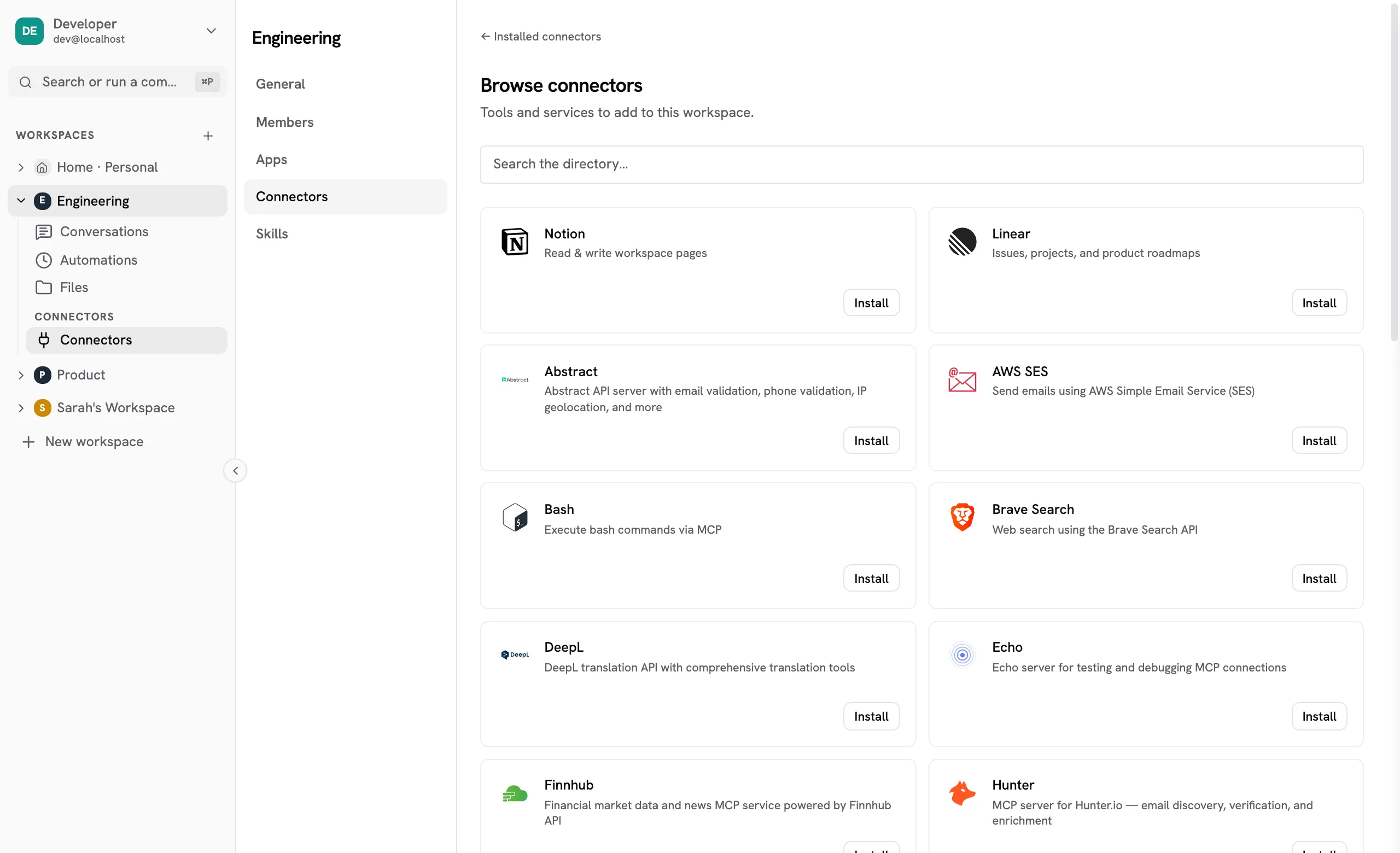
Alternation is the mechanism that makes six of these read as six things.
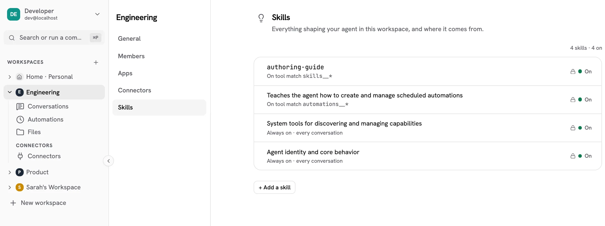
One per page. The window frame flips with the ground.
One sentence over a full-bleed photograph. The scrim belongs to the component rather than to whoever picks the picture, because type over a photograph is a contrast failure the moment somebody swaps it. Shown Default first: neutral ink wash, one line, left. Then the accent treatment with a chip row, which blurs the frame and washes it in the brand blue for a band that is punctuation rather than a caption.

One sentence, and the scrim that keeps it readable.
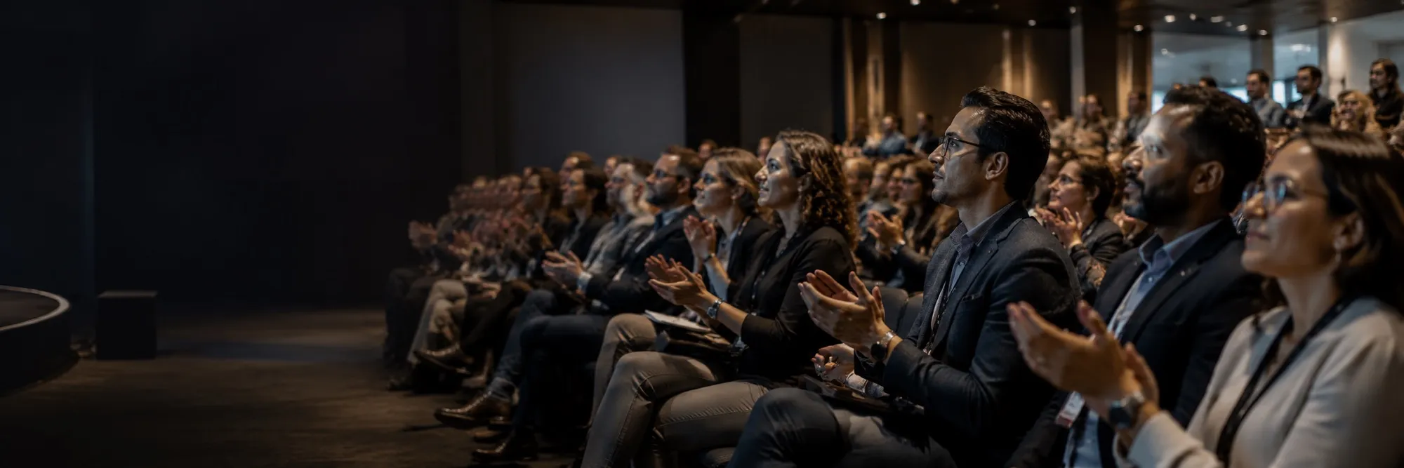
The same band, washed in the accent
The container is a density decision, not a taste one. `rule` is the default and the right answer at six items. `card` is for a short set — four is the width it was drawn for — opening a page, where each item must read as a thing rather than as a column. Do not take `card` to six.
Count the chrome before adding more.
Six bordered boxes is a lot of chrome for six short paragraphs.
Reach for a border when the thing needs to read as a separate object.
A card, a rule, a row of nodes and a line is four treatments for four words.
The card variant
The glyph loses its chip here — the panel is already the ground.
Two adjacent ramp steps, so the tint moves when the accent moves.
Title one step larger, because the card gives it room to carry the item.
Four across, two at 900px, one at 600px.
Every figure is markup on tokens, and every one holds a finished state under prefers-reduced-motion.
Marks drifting at three speeds behind a mask. Says many, without a number that goes stale.
A description being written, because describing is what building is here.
Rows arriving, the last one the thing delivered. Times relative, counts absent.
One script per use case, and the only figure on the site that shows the product rather than the process.
Which inbound is worth my time today?
Thirty-four came in since six. Three clear the bar you set:
The rest are queued by score and every one of them already has an acknowledgement out.
Security by design
A list of security claims is the thing readers skim. Each card carries its own kind of evidence.
You can read the thing that makes the claim.
The runtime executes inside your own boundary.
A session is handed exactly one workspace.
Synapse
A full-bleed dark section mid-page reads as the page ending. Held in the container it reads as an object on the page, and the closing CTA keeps the one full-width ink band.

The copy carries a number, a named system or a mechanism — 33 connectors, 300+ through a gateway.
lucide-astro, not three bespoke SVG diagrams nobody can decode at 96px.
A band where every item is emphasised has emphasised nothing.
Trusted by
Bayze, Scout, Colorcase, Set as text
Runs on
Salesforce, Slack, Notion, GitHub
Any model. Any cloud. No rewrite.
Anthropic, OpenAI, DeepSeek, Qwen, Google Cloud, NVIDIA, Ollama
Shown before the grid expands; the rest sit behind the toggle.
 Salesforce
  Slack
Slack  Notion
  GitHub With a note
 A sample, not the whole catalogue.
A strip, not a screen: the marks are a precondition, not the argument.
Salesforce Slack Notion GitHub A status that overstates is worse than no band at all.
Enforced in the database.
Planned in the architecture.
Shared under NDA.
The record, drawn, for the section that claims there is one. Markup on tokens like `IndustryMark` and `FlowRail` — a screenshot of a log dates the moment an event name changes. It carries no total, no trend and no axis: it is an example of a row, not a measurement.
Two ways of having the same thing, on the same line. A real table, so a screen reader announces the mode with the cell; under 760px the header is replaced by a per-cell label rather than hidden. Shown on `dark`, which is the ground to reach for: the panel stays white, so the table reads as a sheet laid on the band rather than as a region of it. On cream the elevation has nothing to lift away from.
Deployment
A cell holds a phrase. The moment it holds a sentence with a clause in it the row stops being comparable.
| Compared | Self-hosted Your infrastructure | Managed We operate it |
|---|---|---|
| Where it runs | Your cluster | A namespace on ours |
| Who holds the data | You. We never receive it. | You own it; we hold it |
| Upgrades | Your call | We upgrade |
The caveat no cell has room for goes here.
The band that can say no. `none` is a renderable state on purpose — a row of badges that only ever reads yes is a row nobody believes — and it takes the open shield rather than a different shape, so the row still reads as one set. Two further states are not shown: `certified`, for something an outside auditor confirmed, and `architecture`, where the guarantee follows from where the runtime executes.
Ready
Controls operating. Audit not yet run.
On request
A processing agreement on request.
Published
Published on the public repository.
Not yet
No business associate agreement today.
One line, and only where the badges leave something unsaid.
Open source
Where the code and the conversation live.
The fourth opener, and the one none of the other three do: a figure stretched to the full height of a column beside a card. `PageHeader` is a centred measure, `PageHero` puts an aside in the margin, `HeroCentered` is the homepage shape.
Wed, Aug 261:00 PM ET90 minutesFree
One paragraph under it, and then whatever the aside slot holds.

Faces, because people register for people. At one host the cell is square so the headshot shows whole; two or more share the width. Its `note` is written for the page it appears on rather than read from the person's leadership entry, which describes a whole career and lands on a themed event as credentials from another field.

The one white object on an ink band, which is what makes it read as the thing to press. It carries its own label colour for that reason: `Label` picks a lighter blue inside `.section-dark`, correct on the band and wrong on a white card sitting in it.
No portrait and no monogram: we hold no photograph of the people who write these, and initials in a circle are a portrait-shaped hole announcing the portrait is missing. The cards are the exception the border rule names — each is a different person, and a rule between them would read as one voice in paragraphs.
Last session
Wonderful workshop. Very useful take aways.A. Attendee
Looking forward to a continued series.B. Attendee
Useful, and shorter than I expected.C. Attendee
Fixture data. Real ratings carry their count and their source.
Proof
Specimen
No marketing page asserts a client outcome. Proof lives here.
See the full storyFAQ
An answer is prose, and prose at full page width is hard to track.
It opens the page: it carries the h1, so nothing sits above it.
Nothing by that name — which does not mean it cannot be reached. A connector here is an MCP server, so anything with an API is a bundle somebody writes rather than a roadmap item you wait for.
Two marks joined, one claim, two ways forward. No eyebrow: a label over this headline would be labelling itself.
One mark treatment, no descriptions. The name is a rendering of the tool's real name, so it cannot be wrong.
6 actions
Tabs change the ask; the chips are matched out of the connector's own action list.
Draft replies to anything from a customer sitting more than two days.
Calling 2 actions in Gmail
What did we agree with this supplier over email in March?
Calling 2 actions in Gmail
Label anything about the renewal so it stops getting lost.
Calling 2 actions in Gmail
Always three. The numeral leads, the rule runs above, and there is no second row to wrap onto.
Out of the directory, in a click.
Under your credentials, never pooled.
In plain language, or on a schedule.
Platform
One line under the headline; the tabs do the rest.
The systems stay where they are.
Browse and install.
Scoped per workspace.
Skills, apps, automations.
Composed into the prompt.
Run on a schedule.
Under the title, inside the card head.
That is with us.
You hear back inside a business day.
The layout renders these around a markdown body, driven by frontmatter. A content file cannot reach any of them — see CLAUDE.md.


Generated, never exported. An exported image dates and has to be redrawn every time the palette moves. A figure must not imply a claim the page is not making.
The operator's side of the same exchange, in their words.
One card, wider than the rest, carrying a description the others do not get.
Read the pieceWhat we ship, what we learn, what we think about AI in production. No fluff.
What we ship, what we learn, what we think about AI in production. No fluff.
What we ship, what we learn, what we think about AI in production. No fluff.

Two variants, because there were two objects. A label stands on its own in a row of its kind and is the content. A value states a fact about the thing beside it and is a note on it, so it sits lower in the type scale and takes a pill, which reads as a marker where a square-ish block reads as content.
Neither outlines. The border this replaces measured 1.27:1 on white, and four bordered rectangles is a lot of chrome for four short phrases. `value` on ink is a descendant rule rather than a prop, the way `Label` works: a prop asking an author to name their ground is a question the stylesheet can answer.
The accent, where G2's marks above are G2's amber: a third party's badge carries their colour, a rating our own attendees gave us carries ours. The partial row is the honesty rule — marks fill to the rounded score, so a 3.4 cannot present as four.
Navigation and Footer are on every page,
including this one. They are rendered at the top and bottom of this
document rather than duplicated here — a second nav would emit duplicate
ids and a second sticky bar.